Click here to buy secure, speedy, and reliable Web hosting, Cloud hosting, Agency hosting, VPS hosting, Website builder, Business email, Reach email marketing at 20% discount from our Gold Partner Hostinger You can also read 12 Top Reasons to Choose Hostinger’s Best Web Hosting
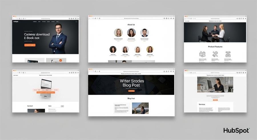
If you’re using the HubSpot Marketing Starter Hub and wondering which website pages matter most (and how to write them), this post is for you. I’ll show practical HubSpot Marketing Starter hub website pages examples — the structure, headline suggestions, key sections, and quick copy you can paste into HubSpot’s page editor. No fluff — just usable templates for sites that convert and read well.
Why these pages matter
Starter Hub gives you the basic tools: landing pages, forms, email, and simple automation. That means your pages should be focused, clear, and easy to test. The pages below are the ones I use first on small sites: they cover discovery (homepage), proof (case studies), conversion (landing pages), and support (resources).

1. Homepage
Goal: Explain who you are and get the visitor to a single next step.
Structure (copy-ready):
Headline: “Make [desired outcome] simple for [audience]”
Subhead: “We help [audience] do [result] with [short value phrase].”
Key benefits (3 bullets)
Hero CTA button: “Get Started” or “See Plans”
Social proof: logos or a short testimonial
One product/solution snapshot (3 features + small CTA)
Footer links: pricing, about, blog, contact
Example:
Headline: Make marketing less messy for small teams.
Subhead: We help small marketing teams publish landing pages, send emails, and track leads with one simple Starter Hub setup.
CTA: Try Starter — Free Trial
GoHighLevel vs HubSpot – Which Is Better for Your Business in 2026?
2. Features / What We Do — scannable details
Goal: Translate features into value. Don’t list every feature — show outcomes.
Structure:
Short intro sentence
Feature blocks (icon + one-line benefit + 1–2 details) — repeat 4–6 times
“How it works” mini-steps (3 steps)
CTA: “See a live demo” or “Start free”
Mini-template item:
Feature title: Landing Pages
Benefit line: Create pages that capture leads in minutes.
Detail: Drag-and-drop templates, form builder, auto-sync to contacts.
3. Pricing / Plans — simple and honest
Goal: Remove friction so buyers choose quickly.
Structure:
Quick tagline: “Pick the plan that fits your team”
2–3 tier cards (Starter / Pro / Custom) — highlight the most popular tier
Bullet list of what’s included per tier (limit to 4–6 lines)
Comparison note: billing cycle, support level, onboarding
CTA under each card: “Start free trial” or “Contact sales”
Tip: On Starter sites keep pricing clear and avoid hidden steps. Show a contact route for custom needs.
4. Landing page (campaign-specific) — designed to convert
Goal: One visitor, one action — download, sign up, register.
Structure:
One-line promise (H1)
Short supporting paragraph
Form (2–4 fields max) or CTA button to modal
Bullet benefits or short checklist
Social proof (quote or logo)
Minimal nav or no nav — keep focus
Copy example:
H1: Download the 7-step B2B email playbook
Form CTA: Get the Playbook
Form fields: Name, Work email, Company, Role
5. Blog / Resources landing — content hub
Goal: Organize content for SEO and lead capture.
Structure:
Featured article hero
Categories grid (Guides, Case Studies, Product)
Email signup form with a clear value proposition (what they’ll get)
Pagination and tags
Quick tip: Use HubSpot’s blog module for automatic tag pages and RSS to email.
6. Case Study / Success Story — proof that helps close
Goal: Show results in a short narrative.
Structure:
Headline with result: “How [Customer] increased leads by 42%”
Challenge → Solution → Results sections (each 2–3 sentences)
Quote from customer (1–2 sentences)
CTA: “See how we can help you”
Template line:
Challenge: Low conversion from seasonal ads.
Solution: Launched targeted landing pages + simple nurture email.
Result: 42% increase in leads in 60 days.
7. Contact / Get Started — easy paths to talk
Goal: Remove resistance to contacting you.
Structure:
Short line: “Talk to our team — 15 min intro”
Contact form + phone number + calendar link (HubSpot Meetings)
Office info (if relevant) and social links
CTA: “Book a call”
8. Thank-you / Confirmation pages — soft re-engage
Goal: Deliver the promised asset and next-step.
Structure:
Confirmation text + download link
Suggested next step (read a related post, schedule a demo)
Social share buttons
Why it matters: Use this page to continue the conversation — send an automated follow-up email from HubSpot with next resources.
9. Knowledge base / Help center
Goal: Reduce incoming support and improve onboarding.
Structure:
Search bar + popular articles
Sections for Quick Start, Troubleshooting, API
CTA: “Contact support” if article doesn’t help
Content & UX tips I always use
Keep headlines benefit-driven (what they get).
Reduce form fields — email + name is usually enough for top-funnel.
Add at least one testimonial or logo on every key page.
Use HubSpot forms and follow-up email to tag contacts automatically.
Keep navigation simple on landing pages — fewer choices means higher conversion.
SEO & internal linking checklist
Use the focus keyword on the page title, H1 and in the first 100 words.
Add internal links: homepage → features → pricing → contact.
Schema: add FAQ schema on landing pages and how-to pages.
Blog: aim 800–1,200 words per pillar post and link to product pages.
Example hubspot page module mapping
Homepage: Hero (CTA) + Features module + Testimonials module + Blog feed module
Landing page: Form module + CTA + Minimal header
Case study: Rich text module + Image + CTA button module
Pricing: Columns block + CTA module
Final checklist before you publish
Page loads under 3 seconds (optimize images).
Forms tested (HubSpot form redirects and email notifications).
CTAs tracked with HubSpot events (for reporting).
Mobile checks done (buttons and form inputs).
Thank-you flow and follow-up email live.
FAQs
Q: Does HubSpot Starter include landing pages?
A: Yes — Starter includes landing page tools and simple templates suitable for campaigns and small teams.
Q: How many pages should I start with?
A: Start with 5–7 pages: Homepage, Features, Pricing, Blog, one Campaign Landing Page, Contact, Case Study.
Q: Can I A/B test in Starter?
A: Starter has limited testing compared to higher tiers. Use clear, small experiments (headline, CTA text) and track results.
Now loading...


