Data is always useful but it is not easy to comprehend it when it is not presented understandably. This is where data visualization comes in; there are many tools and techniques of providing data in a way that helps the viewers to apprehend the given data. It is very important to draw in the user’s attention via proper data visualization so that he/she is better capable of retaining facts. It would definitely require the media, through which the data is presented, to present the information in such a way that it catches the user’s eye and still be intelligible to him at all counts and levels because representation of facts is always better shown through pictorial representation of statistics.
To make it easy for all the data streaming sites to give their data in a most comprehensible way we have brought together a collection of data visualization tools. These are all excellent at performing their tasks and would definitely warrant a try.
Modest Maps is a small, extensible, and free library for designers and developers who want to use interactive maps in their own projects. It provides a core set of features in a tight, clean package with plenty of hooks for additional functionality.
Flot is a pure JavaScript plotting library for jQuery, with a focus on simple usage, attractive looks and interactive features.
Leaflet is a modern open-source JavaScript library for mobile-friendly interactive maps.
Raphael is a small JavaScript library that should simplify your work with vector graphics on the web. If you want to create your own specific chart or image crop and rotate widget, for example, you can achieve it simply and easily with this library.
Deliver pie charts to any device with Pizza. Your pie will be steaming hot with SVG so that it looks good on retina devices and HiDPI devices.
Create beautiful Javascript charts with one line of Ruby.
A charting library built with the Ember.js and d3.js frameworks. It includes time series, bar, pie, and scatter charts which are easy to extend and modify. The out-of-the-box behavior these chart components represents our thoughts on best practices in chart interactivity and presentation.
Cube is a system for collecting timestamped events and deriving metrics. By collecting events rather than metrics, Cube lets you compute aggregate statistics post hoc.
Better World Flux was created as an entry for the World Bank Apps for Development competition. The site aims to raise awareness for the UN Millennium Development Goals by letting users visualize and share stories that are hidden in the World Bank Open Data.
Polymaps is a free JavaScript library for making dynamic, interactive maps in modern web browsers.
Google chart tools are powerful, simple to use, and free. Try out our rich gallery of interactive charts and data tools.
jqPlot is a plotting and charting plugin for the jQuery Javascript framework.
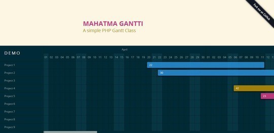
A simple PHP Gantt Class.
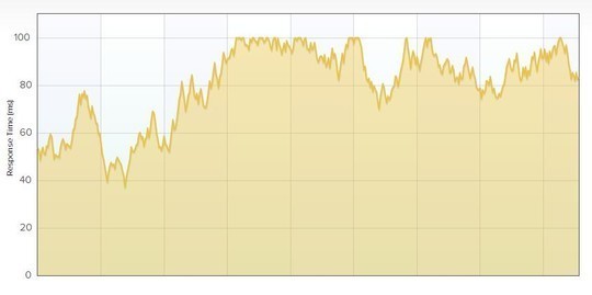
A JavaScript Charting Library for Streaming Data.
Envision.js is a library for creating fast, dynamic and interactive HTML5 visualizations.
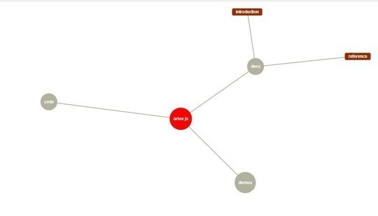
Arborjs a graph visualization library using web workers and jQuery.
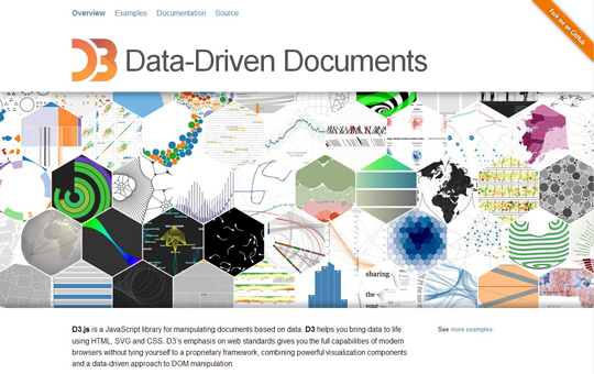
D3.js is a JavaScript library for manipulating documents based on data. D3 helps you bring data to life using HTML, SVG and CSS. D3’s emphasis on web standards gives you the full capabilities of modern browsers without tying yourself to a proprietary framework, combining powerful visualization components and a data-driven approach to DOM manipulation.
Gephi is an interactive visualization and exploration platform for all kinds of networks and complex systems, dynamic and hierarchical graphs.
Interactive javascript charts for your web projects.
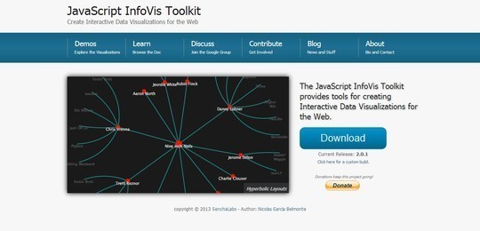
The JavaScript InfoVis Toolkit provides tools for creating Interactive Data Visualizations for the Web.
JpGraph is an Object-Oriented Graph creating library for PHP >= 5.1 The library is completely written in PHP and ready to be used in any PHP scripts (both CGI/APXS/CLI versions of PHP are supported).
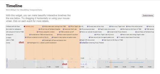
With this widget, you can make beautiful interactive timelines like the one below. Try dragging it horizontally or using your mouse-wheel. Click on each event for more details.
Wolfram|Alpha introduces a fundamentally new way to get knowledge and answers—not by searching the web, but by doing dynamic computations based on a vast collection of built-in data, algorithms, and methods.
Crossfilter is a JavaScript library for exploring large multivariate datasets in the browser. Crossfilter supports extremely fast (<30ms) interaction with coordinated views, even with datasets containing a million or more records; we built it to power analytics for Square Register, allowing merchants to slice and dice their payment history fluidly.
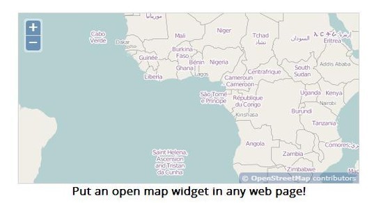
OpenLayers makes it easy to put a dynamic map in any web page. It can display map tiles and markers loaded from any source. OpenLayers has been developed to further the use of geographic information of all kinds.
The missing link between spreadsheets and vector graphics.
A force directed graph layout algorithm in JavaScript.
A lightweight graphics library with an intuitive graphics API and an SVG renderer.
HumbleFinance is an HTML5 data visualization tool written as a demonstration of interactive graphing in HTML5.
D3.js is a JavaScript library for manipulating documents based on data. D3 helps you bring data to life using HTML, SVG and CSS.
Protovis composes custom views of data with simple marks such as bars and dots. Unlike low-level graphics libraries that quickly become tedious for visualization, Protovis defines marks through dynamic properties that encode data, allowing inheritance, scales and layouts to simplify construction.
Axiis is an open source data visualization framework designed for beginner and expert developers alike.
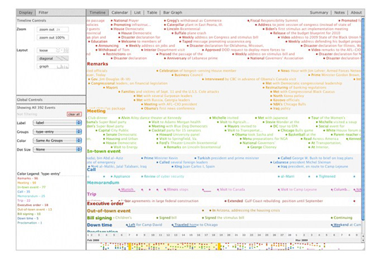
TimeFlow Analytical Timeline is a visualization tool for temporal data. The current release is “alpha” software—a very early version that may have bugs and glitches.
The Swiss Army Knife of Vector Graphics Scripting – Scriptographer ported to JavaScript and the browser, using HTML5 Canvas.
Now loading...

