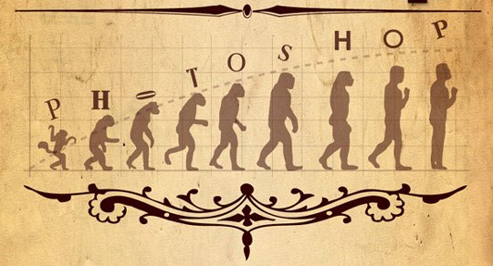
Evolution of Photoshop is one of the fastest known evolution in last two decades. Who would have thought that a little software will become a giant in short period of time. This infographic illustrates the journey of Photoshop that started as a baby which became the industry leader in these two decades.
Showing posts from Category: Infographics
show all postsThis infographic was done by Jesse Thomas of digital creative agency Jess3 in which they have covered relative size of social networks and online services such as Skype, Gmail, MySpace, Twitter and Foursquare, and also shows the proportion of their user base that access the service via a mobile device in quite details with easy to understand presentation.
This is the post dedicated to the creative examples of infographics with revealing facts about Online Holiday Sales Trends . With the help of these infographics, you will get an idea in one place that what people are buying in holiday season and what are the average spending over the internet. The execution of these infographics are quite well with easy to understand presentation in creative manner. This list is not long in numbers, but I promise you that when you start watching them it will really amaze you.
Few months back Samsung launched its first Android-based compact tablet computer at the 2010 IFA in Berlin. It features a 7-inch (180 mm) TFT-LCD touchscreen, Wi-Fi capability, a 1.0 GHz ARM Cortex-A8 (“Hummingbird”) processor, and the Swype input system. It is equipped with a 3.2 MP rear-facing camera and a 1.3 MP front facing camera for video calls. Let’s move on the applications for Samsung Galaxy Tab. There are tons of apps available but some of them are totally awesome. We are going to tell you guys about the top 5 apps for Samsung Galaxy Tab. Below is a list of some excellent applications for Samsung Galaxy Tab.
Do you guys know what comes after Terabyte? It’s Petabyte which is a unit of computer memory or data storage capacity equal to 1,000 terabytes. Recently, I found an infographic in which you will get the answer of the question “How Much is a Petabyte?”. This infographic was created by Mozy to visualize and understand Petabytes with the help of Gigabytes.
Recently, I have found graphical visualization “History Of The Internet” created by Online MBA who used simple to understand graphical format to show from where the internet and all the world wide web legends came from. If you go through this graphic, you will get information from 1962 to 2009 about all the major happenings about the internet.
E-mail spam, known as unsolicited bulk Email (UBE), junk mail, or unsolicited commercial email (UCE), is the practice of sending unwanted e-mail messages, frequently with commercial content, in large quantities to an indiscriminate set of recipients. Spam in e-mail started to become a problem when the Internet was opened up to the general public in the mid-1990s. It grew exponentially over the following years, and today composes some 80 to 85% of all the email in the world, by a “conservative estimate”. I have recently came across to really interesting infographic about “Spam” and I want to give 5 stars to Infographic World who created this.
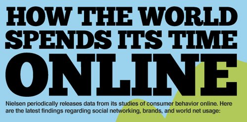
Internet is the most widely used medium of communication, gathering information etc. world wide. So for that here is a well collected data represented as infographic stating that How the World Spends its Time Online.
This infographic was done by Visual Economics in which they have covered Total Time Spent Worldwide, Most Popular Brands, Social Network Usage, Daily Internet Activities in quite details with easy to understand presentation.
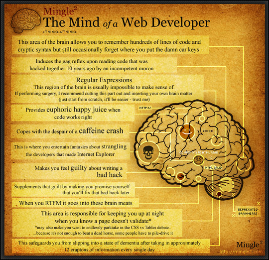
Human Brain is one of the most advanced and most powerful biological organ known to mankind. We all know or can find the functions of brain in diagrams etc. easily, but have you ever thought how a programmer’s brain and mind functions?
I just found something interesting to share with all of you. It’s an interesting illustrated diagram to understand that how complicated the developer’s mind is or how much processes are functioning to make his job done.
I have recently came across to really interesting infographic about “The Social Media Effect”. This graphic was beautifully executed to drive the flow from when the content was created to the ultimate level of viral marketing. It was never this much easier before but after coming of social media in our lives anyone can go to the highest level of content distribution in very short span of time. Obviously the content needs to be really excellent and viral in nature to achieve this. To acknowledge this amazing work I want to give 5 stars to Infographic World who created this infographic.



![7 Revealing Infographics About [ONLINE] Holiday Sales Trends 3 7 Revealing Infographics About [ONLINE] Holiday Sales Trends 3](https://www.smashingapps.com/wp-content/uploads/2010/12/holidays-online-selling.jpg)


![How Much Is A Petabyte? [Graphic] 5 How Much Is A Petabyte? [Graphic] 5](https://www.smashingapps.com/wp-content/uploads/2010/12/whats-a-petabyte.gif)

![History Of The Internet [Graphic] 6 History Of The Internet [Graphic] 6](https://www.smashingapps.com/wp-content/uploads/2010/11/500x_internet-history.jpg)

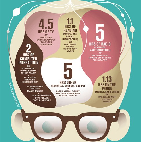
![How Americans Consume 3.6 Zettabytes A Day [Infographic] 7 How Americans Consume 3.6 Zettabytes A Day [Infographic] 7](https://www.smashingapps.com/wp-content/uploads/2010/11/upswing_data_consumption6202.jpg)
![Interesting Facts You Might Not know About SPAM [Infographic] 8 Interesting Facts You Might Not know About SPAM [Infographic] 8](https://www.smashingapps.com/wp-content/uploads/2008/10/spam-emails.jpg)

![How The World Spends Its Time Online [Infographic] 9 How The World Spends Its Time Online [Infographic] 9](https://www.smashingapps.com/wp-content/uploads/2010/09/time-spent-online-small.jpg)

![The Social Media Effect [Infographic] 11 The Social Media Effect [Infographic] 11](https://www.smashingapps.com/wp-content/uploads/2010/06/the-social-media-effect.jpg)

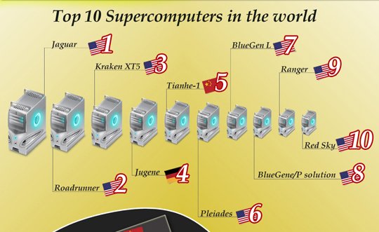
![The Truth About Top Supercomputers In The World [Infographic] 12 The Truth About Top Supercomputers In The World [Infographic] 12](https://www.smashingapps.com/wp-content/uploads/2010/04/truth-about-top-supercomputers-in-the-world-main.jpg)
