Now loading...
In this collection, we are showcasing 40 free and outstanding tools for creating responsive website layout. Last years so many free open source tools and resources were realized and they all got the attention of the web developers. But so many designers are hesitant to use these tools because the performance of these tools is quite change and different.
With these tools web designers and web developers can easily create some amazing and responsive website layouts because you can directly connect these tools with responsive web design, handling CSS and other typical features. We hope that you will find all these tools helpful for you and that these tools will help you in creating outstanding and responsive website layouts. Do give your feedbacks about this collection.
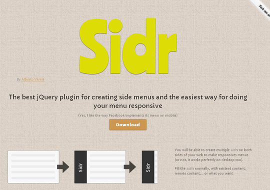
The best jQuery plugin for creating side menus and the easiest way for doing your menu responsive.
A Style Tile is a design deliverable consisting of fonts, colors and interface elements that communicates the evolution of a visual brand for the web. Learn how to use them here.
PhotoSwipe is a FREE HTML/CSS/JavaScript based image gallery specifically targeting mobile devices.
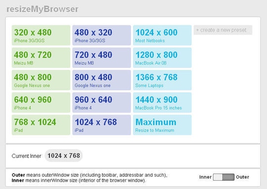
A simple, useful and beautiful browser window resize app for Web designers and developers.
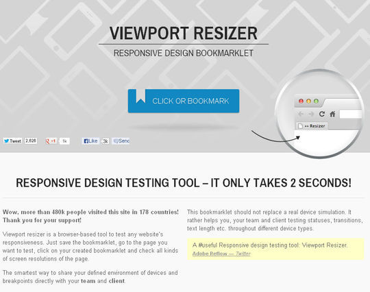
Viewport resizer is a browser-based tool to test any website’s responsiveness. Just save the bookmarklet, go to the page you want to test, click on your created bookmarklet and check all kinds of screen resolutions of the page.
TinyNav.js is a tiny jQuery plugin (443 bytes minified and gzipped) that converts ul and ol navigations to a select dropdowns for small screen. It also automatically selects the current page and adds selected=”selected” for that item.
Blueberry is an experimental opensource jQuery image slider plugin which has been written specifically to work with fluid/responsive web layouts.
Responsive Img swaps out an image’s src attribute based on its container’s width when the DOM is ready and when the browser is resized.
Just a simple calculator to help turn your PSD pixel perfection into the start of your responsive website.
Adaptive Images detects your visitor’s screen size and automatically creates, caches, and delivers device appropriate re-scaled versions of your web page’s embeded HTML images. No mark-up changes needed. It is intended for use with Responsive Designs and to be combined with Fluid Image techniques.
Wirefy is a style agnostic wireframe tool built on the principles of content first. It allows you to create functional responsive wireframes using standard elements. Many frameworks focus on quick layouts and base styles. This allows you to focus on the content rather than the subjective design decisions.
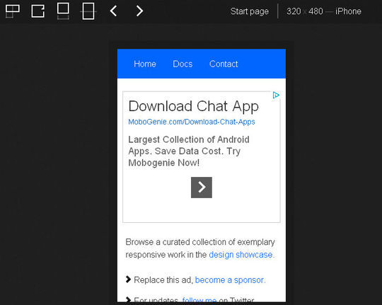
Enter the url to your site – local or online: both work – and use the controls to adjust the width and height of your viewport to find exact breakpoint widths in pixels. Then use that information in your media queries to create a responsive design.
Free Responsive Web Design Testing Tool – ViewPorter. Test your responsive website design while you build them.
The purpose of stacktable.js is to give you an easy way of converting wide tables to a format that will work better on small screens. It creates a copy of the table that is converted into a 2-column key/value format.
Responsive web design sketch sheets
During Denise Jacobs’ workshop on CSS3 at ConvergeSE 2011, I was inspired to make these responsive web design sketch sheets to help think through layouts for various devices. Thought I’d share. Click on the image below to download the .zip.
The Responsinator is designed to test responsive websites on different device resolutions.
The Responsinator is designed to test responsive websites on different device resolutions.
A folding grid for responsive design.
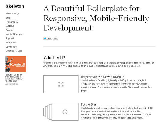
Skeleton is a small collection of CSS files that can help you rapidly develop sites that look beautiful at any size, be it a 17″ laptop screen or an iPhone.
Elastislide is a responsive image carousel that will adapt fluidly in a layout. It is a jQuery plugin that can be laid out horizontally or vertically with a pre-defined minimum number of shown images.
A lightweight, easy-to-use jQuery plugin for fluid width video embeds.
An awesome, fully responsive jQuery slider toolkit.
The idea of the original was to abandon the grid layout of the table and make each cell its own line. Each of those lines is labeled with a pseudo element. This creates a much taller table, requiring more vertical scrolling, but does not require horizontal scrolling. It’s easier to browse the data without losing context of what’s what. The downside is that you might lose the context of data comparison, since you no longer see see cells of data right next to other cells of that type.
ProtoFluid simplifies the development of fluid layouts and adaptive CSS. It builds precise, dynamic viewports in which to test your website or app.
Responsive Design, Responsively Illustrated
Resize your browser to reveal just a handful of the kind of devices you should expect web pages to be viewed on. Each device illustration is rendered using the same basic HTML which adapts its appearance to the changing viewport size, representing different devices accordingly. This is achieved using media queries to apply different CSS rules for different sizes. This experiment is intended to illustrate the basic premise of responsive web design and the power of CSS to tackle it.
Through fluid grids and media query adjustments, responsive design enables Web page layouts to adapt to a variety of screen sizes. As more designers embrace this technique, we’re not only seeing a lot of innovation but the emergence of clear patterns as well. I cataloged what seem to be the most popular of these patterns for adaptable multi-device layouts.
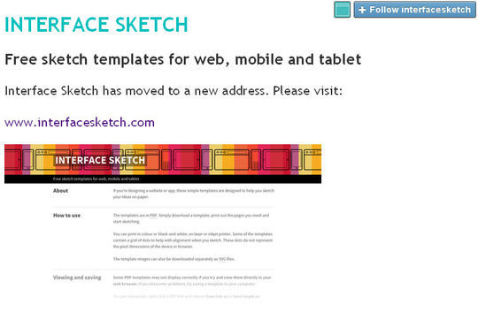
Free sketch templates for web, mobile and tablet platforms.
Sleek, intuitive, and powerful front-end framework for faster and easier web development.
Designing grids with Gridset is as easy as dragging guides in Photoshop or Fireworks. Gridset provides whatever you need: PNGs, a comprehensive cheat sheet and CSS.
Parallax scrolling responsive framework.
Made with HTML/CSS (no images, no JS*) this is a simple interactive experiment with responsive design techniques. Use the buttons top-right to toggle between desktop and mobile layouts.
A Device-Agnostic Approach to Complex Site Navigation.
Design responsive CSS layouts for all screen sizes and export to an HTML code editor with Adobe Edge Reflow CC. Learn more.
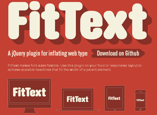
FitText makes font-sizes flexible. Use this plugin on your fluid or responsive layout to achieve scalable headlines that fill the width of a parent element.
Responsive and SEO Friendly Data Tables.
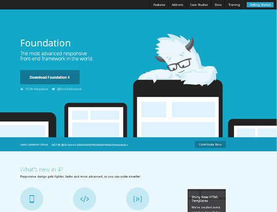
The most advanced responsive front-end framework in the world.
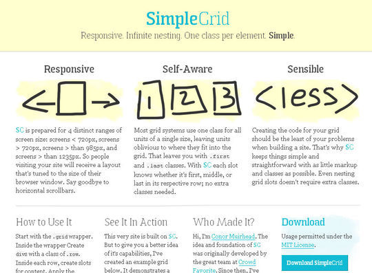
Responsive, Infinite nesting, One class per element, Simple.
This tool has been built to help with testing your responsive websites while you design and build them.
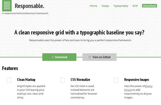
Responsable uses the power of less and sass to bring you a perfect responsive framework.
A starting point to responsive web design!
Now loading...
